The Challenge
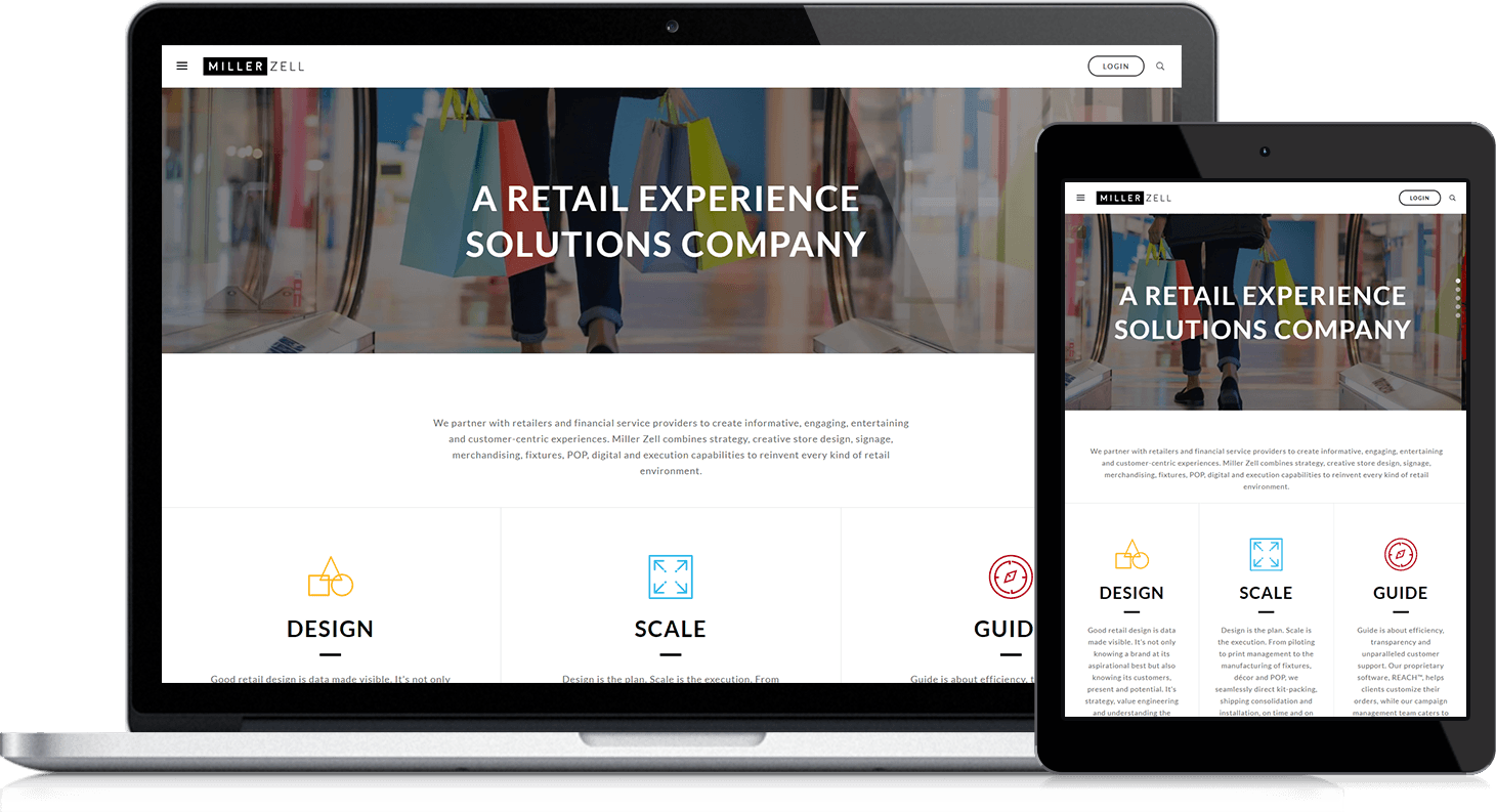
Miller Zell, a retail experience solutions company, always had an aesthetically attractive website. But after traffic analytics revealed high bounce rates for several of their pages, they realized looks could be deceiving. While visually appealing, their video headers slowed their site speed. Their navigation was overly complicated. And, most importantly, they discovered their content was difficult to find, muddying their visitors’ buyer journeys. Knowing all this, they turned to Lynton to help refresh their site to be both well-designed and lead generating.
The Solutions
Before beginning the redesign, Miller Zell completed their branding updates and provided comprehensive style guidelines. Their team's clear vision and quick feedback enabled seamless collaboration throughout the project.
Key improvements included:
- Custom HubSpot themes matching approved wireframes
- 15 unique, reusable templates
- Full content population including buttons, images, forms, and custom animated GIFs
- Live "Solar Performance" report using JavaScript for real-time sustainability tracking
- Streamlined navigation to highlight full service offerings
- Comprehensive quality assurance testing
- HubSpot functionality training for the Miller Zell team
The Results
The new website successfully addressed Miller Zell's core challenges by improving site speed, simplifying navigation, and creating clear pathways to content. Custom templates and reusable layouts provide scalability for future growth, while the real-time sustainability tracker showcases their environmental commitment without manual updates. The platform now effectively demonstrates their full service capabilities to existing clients while maintaining the visual appeal that originally defined their brand.
Every time I reach out to the Lynton team they surprise me by solving problems that Google told me were impossible. They are very skilled at creating from scratch and modifying existing modules for our site. They have quick turnaround and great communication. I thought it was going to be a pain to work with an agency rather than an in house team but they have exceeded my expectations. Hire them! You won't regret it.”
Amber Collins
Miller Zell

