The Problem
Backed by extensive scientific research and the official company founding in 2015, Nephure was ready for action. Almost. The company was definitely ready to set up a website, but not yet release its products. In fact, the goal of the site was to create a lead-generating engine before it started to sell its products.
The Solution
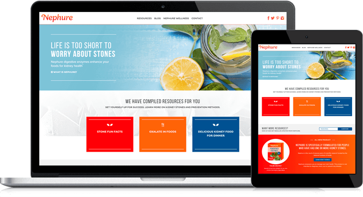
The objective of the entire website was to build a list of subscribers, and Lynton got to work on HubSpot creating Nephure’s first-ever site with that ultimate goal in mind. Capturing visitor email addresses is an effective method of gathering leads, and the new site offers multiple opportunities to do so. These include:
- Exchanging email address for downloadable content
- Subscribing to the blog
- Using the on-site contact form
- Signing up to receive updates when Nephure is available
Downloadable content includes recipes, information about oxalates, kidney stone resources, and other white papers in the customized resource center geared toward the company’s four target audiences.
Other requirements for the new site included being engaging and friendly for users and optimized for conversions. Lynton covered all bases, with a crisp, clean design, compelling colors and visuals, flip tiles and other custom modules, and straightforward, easy-to-follow navigation.
As the B2C face of Nephure brands, the website is primed to soon include a store that can readily sell products geared toward its existing, engaged audience. Even though products are not yet available, the site is hard at work collecting individuals interested in the content offered – who are primed for conversion down the line.

