The Problem
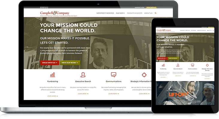
In 2014 Campbell wanted to push the brand forward, to match their successful leadership in the nonprofit industry. They wanted to streamline the resources they make available for clients and prospects and create a better user experience overall. In need of a partner that knew the HubSpot platform and its nuances, they chose Lynton.
The Solution
Campbell and Company is thrilled with the new website. The templates are a better representation of their brand and are able to collect more leads - whether that user is browsing from a desktop, tablet, or phone.


