10 Ways to Improve Your Home Builder Website For Lead Generation
01/22/2015 • 5 min read • Written by Lynton
Crosswater at Pablo Bay, a PARC Group home builder community located in Jacksonville Florida, is a LyntonWeb favorite. We recently designed their new website, and have been working together to create a great inbound marketing experience for their website visitors.
They have a website that's built and optimized for lead generation and user experience. It's built with the visitor in mind, and I figured that other home builders and communities could learn a thing from their site. If you are in the industry, here are 10 things you can add to your home builder site to improve your lead generation:
1. Have a video on your site
This is a great way for your visitors to get a true feel of what your homes are like. Especially if you have visitors that don't live in your area. You can do a tour of the community amenities, look inside the homes, even have residents on camera giving their testimonials.
Interested in including video in your website or marketing plan? LyntonWeb is a partner of SoMedia and teamed with Crosswater to create this video.
2. Have advanced content for your community
It's important to have images and videos so your visitors can get a realistic feel of what life in your community and is like. It's also important for them to have more in depth information about what life in and around your community is like. More than just pictures of the amenities and club house. Crosswater has an eBook titled Life at Crosswater at Pablo Bay gated behind a short form. It gives information on the schools, location, and other community amenities. This eBook has given them an idea of who is interested in their community and how they can nurture to them in the future.
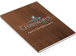
3. Have advanced content for your home builders
Having something for your visitors to download for each home builder is just as important. It's almost the next step after they've downloaded advanced content about your community. You can consider these leads a bit further down the sales funnel as well. They've shown interest in your community, now you want to be sure to give them more detailed information about specific home builders. Crosswater created a Builder's Guide to Your Dream Home to do just that.
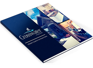
4. Create a Find Your Home tool
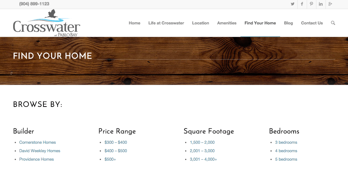
The Find Your Home page is one of Crosswater's most viewed pages on their website. It allows the visitor to quickly and easily find their dream home at Crosswater. They are able to search by builder, price, square footage, even the number of bedrooms. They can then view the actual builder name, the name of the floorplan, and details on that specific home. Then there's an opportunity for the visitors to to convert by actually requesting to contact that builder and learn more about them.
5. Blog and blog often!
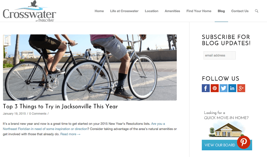
Crosswater consistently blogs relevant topics to residents of Crosswater and residents of Jacksonville alike. They blog about specific homes and builders in Crosswater, as well as what life at Crosswater and life in Jacksonville is life. Each blog has a relevant call-to-action to leads visitors back to the site to download an eBook. There's also a place for visitors to subscribe to the blog to receive articles on a consistent basis.
6. Create lead nurturing campaigns for website offers
Crosswater has great pieces of advanced content on their website available to download (see #2 and #3). But they also have lead nurturing emails set up once visitors have downloaded these offers as well. These lead nurturing emails give the visitors more information about Crosswater. It also gives them more opportunities to download other pieces of content and drive the leads further down the sales funnel.
7. Have contact forms for each builder
Crosswater knows that potential residents may be interested in Crosswater because of a specific home builder. That's why they have specific pages dedicated to each home builder. Website visitors can read more about the home builder, their history, and even value proposition and what makes them unique. Then they are taken to a contact page with a form, phone number and email address for that home builder.

8. Have an interactive map
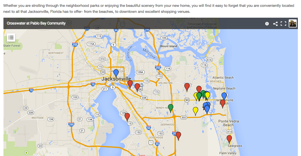
Crosswater created an interactive map on their location page that gives website visitors an idea of what is near their community. An interactive map gives visitors a visual sense of how close the beach, how far the nearest Target, grocery store, and hospital is without having to look it up. The visitor can actually see for themselves how close the community is to the beach. Much more effective than just saying "We're close to the beach!"
9. Have a simple contact page
This one seems simple, but some websites just don't understand how important this page is. Crosswater makes their contact information very clear. For starters, their contact page is in the main navigation. There's a simple contact form, and also options for visitors to find them on social media or actually call the office if they aren't ready to fill out a contact form. There's also a map that shows exactly where their community is located, and gives visitors the option to come view their community.
10. Be active on social
If you have these awesome lead generating eBooks on your websites and places for your visitors to convert, but you're not posting them to your social media channels, you're missing many opportunities. Post about your eBooks, your videos, blogs, even specific website pages to your social media channels. Post often and consistently to drive traffic and leads back to your website.
Crosswater at Pablo Bay is one example of a home builder site that is built for lead generation. They have great advanced content, plenty of places for visitors to convert, they are active on social, and they are seeing their number of leads rise because of it.
Want more information on how LyntonWeb can help optimize your website for lead generation? Let's talk.
You May Also Like

Sales & Marketing
Ways to Increase Your Nonprofit Website’s Conversion Rate
Nonprofit websites serve a host of functions, but one of their most crucial is to convert visitors into donors. Here are a fe...
Keep Reading
HubSpot
Why You Should Build Your Nonprofit Website on HubSpot
If your website is poorly designed, it can tank a donor’s first impression and send them away. Here's why you should build yo...
Keep Reading
Lead Generation
Demand Generation vs. Lead Generation: What Should Your Site Focus On?
How it drives these sales typically fits into one of two categories: demand generation or lead generation. When it comes to y...
Keep ReadingSubscribe Today

