5 Ways You're Harming Your Website Functionality
06/19/2019 • 3 min read • Written by Lynton
Did you know little things, like an oversized image or HTTP over HTTPS, are harming your website, making it difficult to load, attract users, and convert leads? Because your website is the first thing many people see about your brand, it’s important it looks good - and works properly. Here’s what to avoid to ensure your website both attractive and functional.

Not Using a Content Management System
While a content management system (CMS) is not technically required for your website, there are many benefits of using one that positively affect your website functionality. For example, without a CMS, your website will likely be built using static pages that are uploaded directly to servers – which severely limits your ability to scale and improve your site. If you build it this way, anything you want to be removed, updated, or changed on your website must be done by a developer. And most developers are busy managing other tasks for your company, so the errors can quickly pile up and potentially damage the perception of your brand. No one wants a ton of spelling errors they can’t fix.
Likewise, without a CMS, it’s more difficult to test different functionality like CTAs, videos, blog templates, landing pages and more. A CMS also allows you to create pages easily through the use of templates, which helps the functionality and layout of your site look consistent as it grows.
Using Tables for Layouts
During the ’90s and 2000s, you probably saw a lot of websites designed with table-based layouts. Today, that trend is all but extinct. Using tables for layouts went out of style for several reasons including:
- More bytes of markup which take longer to download
- Bad user experience due to slower site speeds
- Difficulty maintaining code
- Locking developers into the design, making redesigns much harder
- Breaking text copying on specific browsers
Not Using HTTPS/SSL
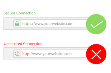
 Though the visual difference between HTTP and HTTPS is only one letter, the impact that extra letter has on your website’s performance is critical. HTTPS encrypts information you send between a web browser and a web server, protecting your users from attacks. To have HTTPS on your site, you must purchase and install an SSL certificate. Once you have it installed, you’ll reap the benefits of a more secure website like:
- Increased consumer confidence. With more cyber-attacks making the news, more online visitors are looking for safe sites. That peace of mind can also lead to more conversions, too, as more people are willing to input their personal information and data on a website they feel is secure.
- Higher Google rankings. Google has confirmed they favor HTTPs. And because it’s almost every marketer’s goal to rank high in search engine results, having HTTPS should be high on your website list.
Not Having a Responsive Design
Consider your personal belongings. You probably have a smartphone, a laptop, a tablet, and maybe even a desktop computer. You also likely use all of these to surf the web at one point or another. And when you come across a website that doesn’t look good on your phone, you may leave. If your own company’s website doesn’t render correctly and loads slowly on a mobile device, your visitors are also disappearing.
Another reason to ensure your website is optimized is for Google (yes, again). For years now, Google has penalized websites that aren’t mobile-friendly and provide bad functionality to mobile users. The penalization? Lower search engine rankings. That means if your site isn’t responsive, you’re losing out on a lot of organic traffic and potential sales. And while some people think redirecting users to a mobile version of your site may fix this issue – it doesn’t. Doing this doesn’t help with search engine results as it sends users to a separate website; something they probably don’t want to do.
Using Features That Slow Your Website
Designing and creating your site is a fun process. But you’ll need to use discretion when deciding what visual elements to add because not everyone is using the same browser or has the same internet speed. To avoid bloating your website to the point that it doesn’t load quickly, avoid using elements like:
- Multiple full-sized videos
- Frame-based designs
- Too many big images or animations
- Marquee fonts
- Having automated music or sound
- Overloaded navigation
- Splash or entrance pages
Even if a user makes it past your potentially slow-loading site, the misuse or overuse of some of these features could confuse them – causing them to bounce, leaving you with a lost conversion.
Don’t Worry, We Can Help
These five things may leave you feeling insecure about your current site or an upcoming website project. But at LyntonWeb, we live and breathe website design, development, and functionality. To avoid making these errors and get the most out of your site, schedule a consultation today.
You May Also Like

HubSpot
Introducing the Wix + HubSpot App: The Latest SyncSmart Innovation
Thanks to a partnership with Wix, the team at SyncSmart has launched a free HubSpot + Wix app that allows you to enjoy HubSpo...
Keep Reading
HubSpot
How Users can Boost Marketing with HubSpot and Wix
Have you built your website on Wix and want to use the power of HubSpot without migrating your site? Read more about SyncSmar...
Keep Reading
HubSpot
What is Data Sync? An Overview of HubSpot's New Operations Hub Feature
With Data Sync, you can keep your data consistent with two-way and historical syncing. Learn more about this new HubSpot Oper...
Keep ReadingSubscribe Today

