Designing Traditional Websites vs. Inbound Marketing Websites
12/09/2013 • 3 min read • Written by Rob Walz
As a designer, I always want to design a site that not only looks good, but is easy to navigate and provides a good user experience. With designing a traditional website I can probably stop there, be happy with myself and crack open a celebratory beer.
But times have changed with the growing adoption of Inbound Marketing, which has completely affected the way I approach a design when that project lands in my inbox.
So what is the big deal?
Content is King.
The biggest difference between traditional websites vs. inbound websites is that inbound sites are much more focused on the content, leading the user to action, and getting results. In short, the idea is that your visitors will be driven to eat up all the great content your site provides (like videos, e-Books, whitepapers, infographics, blogs, etc.), turn into leads, and ultimately convert into loyal customers. The main denominator of this idea is content.
So for me, I need to make sure that the content (marketing message) is getting through loud and clear to the user. I need to make sure that I engage them visually without distracting them from the marketing message. And I also need to guide the user through the website.
Simplicity and Usability are Key.
Most people searching and researching online know what they are looking for and want it now. If they can’t find what they are looking for on your site pretty quickly then guess what? As Sweet Brown once said, “Ain't nobody got time for that!” There are literally gazillions of other places on Google that people can search to find what they want. So why should they stick around on your site?
On an inbound marketing website, everything on your site needs to be intuitive to the user. Your site should be easy to navigate. Also, your calls-to-action and offers should not only be attractive but be clear to your audience. You probably want people to be able to easily contact you, right? Give them the information they need without requiring extra clicks or scrolling. Is your site responsive? Why not? All of these elements and more really come down to making your website simple and easy to use.
And these elements are imperative if you are thinking about designing an inbound website, probably not so much for the traditional websites of old.
From my experience, creating a website design with these factors in mind can be pretty difficult; that's why I put together a handy infographic with Inbound Web Design tips.
The Future is Now.
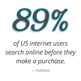
 Traditional websites are fast becoming part of the past. The year 2014 is fast approaching. Your site is the most accessible gateway to your business and the services you provide. Fact: 89% of US internet users search online before they make a purchase, even when the purchase is made at a local business (- HubSpot). Make sure you put your best foot forward and get results.
If you have not thought about inbound marketing for your business by now you probably should. Start thinking about your customers, how your business can help them, and make a lasting connection with them. It is no longer about making a website that just looks cool with no substance; your site and the content you provide needs to have a soul if you want people to stick around.
Curious about what inbound can do for you and your website? Are you ready for a change in the New Year? Contact the experts here at for all you Inbound marketing and website needs.
You May Also Like

Web Design & Development
Putting the "Inbound" Into Your Inbound Website
Learn what your website needs to truly be an "inbound marketing" website.
Keep Reading
Web Design & Development
5 Ways You're Overthinking Your Inbound Marketing Website
Here are 5 things you are overthinking on your inbound marketing website because, in the grand scheme of things, they matter ...
Keep Reading
Web Design & Development
Launching Your Site On HubSpot's COS the Right Way [Inbound Website Tips]
Follow these useful inbound website tips to make your HubSpot COS launch a success!
Keep ReadingSubscribe Today

